Coronavirus Statistics: Tracking The Epidemic In New York
GOTHAMIST
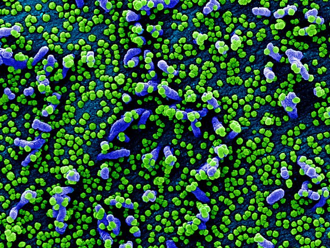
Colorized scanning electron micrograph of a VERO E6 cell (blue) heavily infected with SARS-COV-2 virus particles (green), isolated from a patient sample. Image captured and color-enhanced at the NIAID Integrated Research Facility (IRF) in Fort Detrick, Maryland. NIAID

The Gothamist/WNYC newsroom is using statistics to shape our daily coverage of the COVID-19 epidemic. These are our current charts, based on information we get from the city and state.
Please send any questions or comments to data@gothamist.com.
Positive Cases
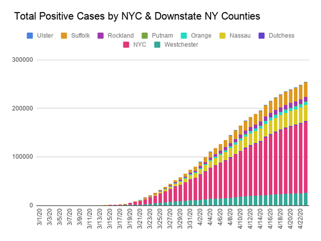
The majority of the state's cases are in New York City, but the downstate suburbs of Westchester and Nassau County are also major contributors to the total. Positive cases track only people with a positive COVID test result- because testing has been limited, the number of people actually sick with COVID is much higher- about 10X to 15X the positive cases, according to New York State's first widespread antibody screenings.
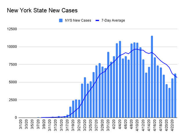
As the curve in new cases begins to flatten, the trend will be easier to see looking only at new state cases.
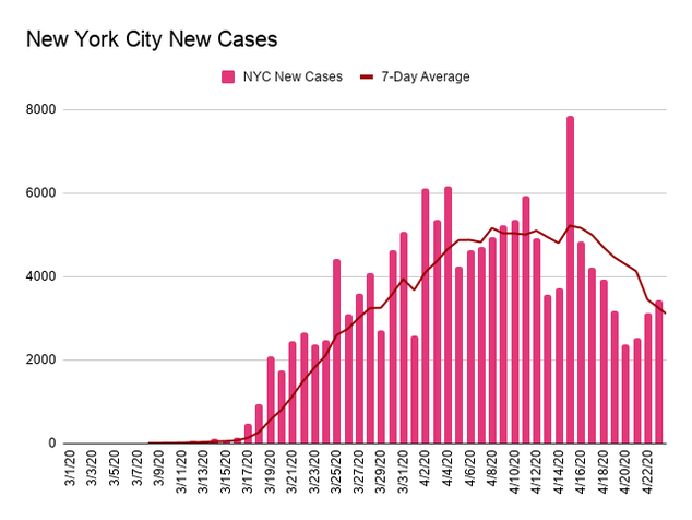
New York City has recently been making up about half of the new cases in the state.
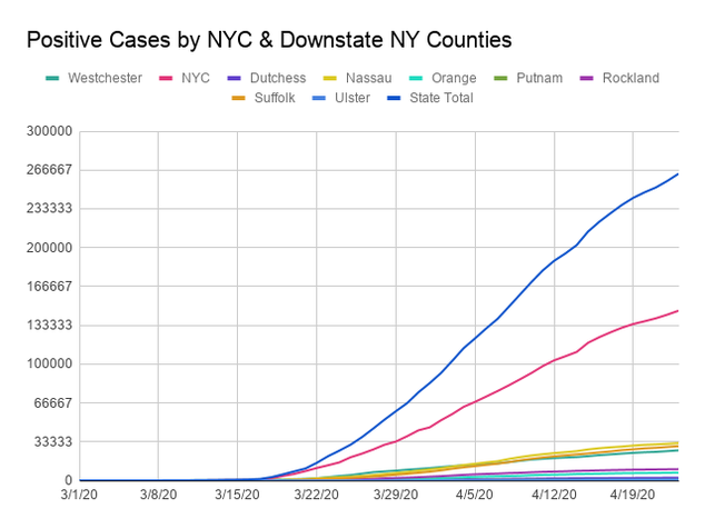
This graph allows you to compare the county totals more easily- note how NYC outstrips any of the other counties.
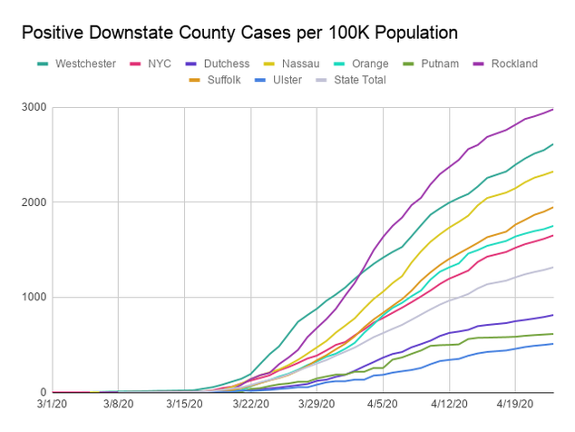
When normalized for population, Rockland and Westchester counties are leading the other downstate counties in cases by a large margin. On April 21, Lombardy, the center of the outbreak in Italy, would be around 670 on this graph. Nassau and Suffolk counties have more cases per capita than New York City.
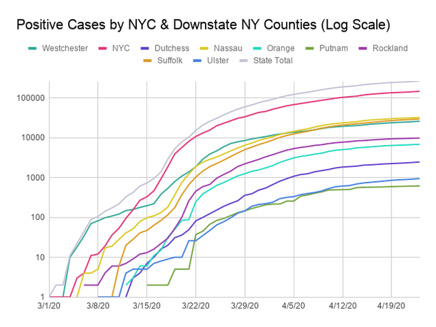
Over time, as social distancing works, we should see each county curve flatten to a horizontal line.
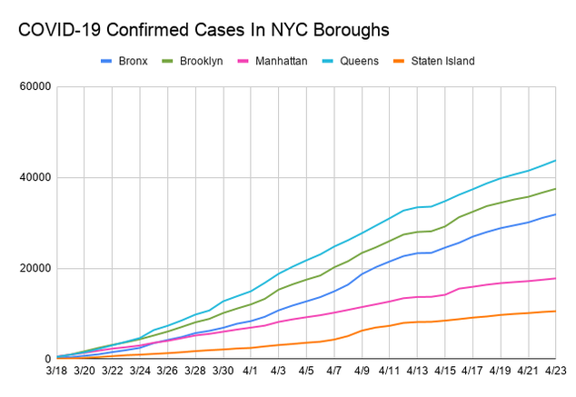
Queens and Brooklyn have larger populations than the other boroughs, so they have more cases.
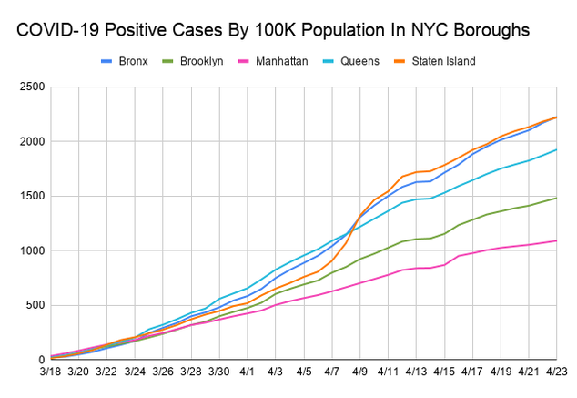
At the beginning of the outbreak, all boroughs had similar infection rates, but over time, Queens and the Bronx have pulled away from the other three boroughs, and over the last few days Staten Island has risen to join them- it took the lead on 4/9.
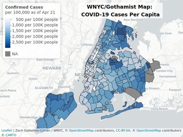
Starting on 4/1, the New York Department of Health started to release positive cases by Zip Code information. Currently the neighborhoods with the highest per capita caseloads are Boro Park, in Brooklyn, and the Corona / Elmhurst area in Northern Queens. You can see numbers, as well as related demographic information, for each zipcode at our larger map.
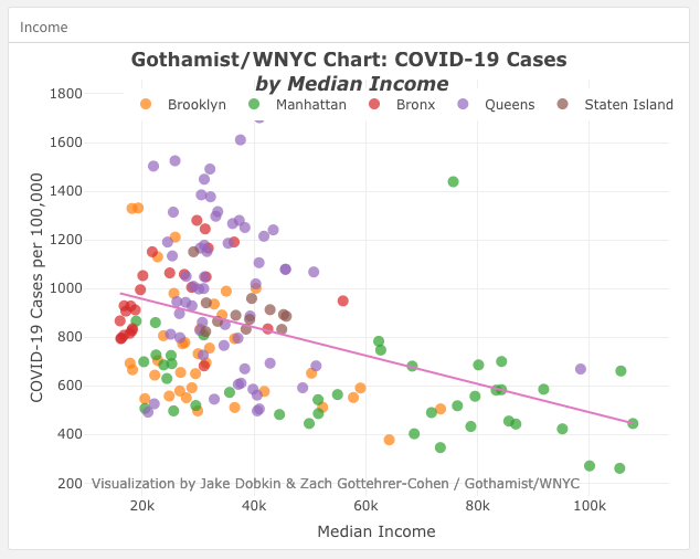
We've charted the positive case zip code data in scatterplot. On average, the lower income, older, and more diverse a neighborhood is, the more positive cases it will have. You can examine individual neighborhoods and various demographic factors on our larger chart.
Deaths
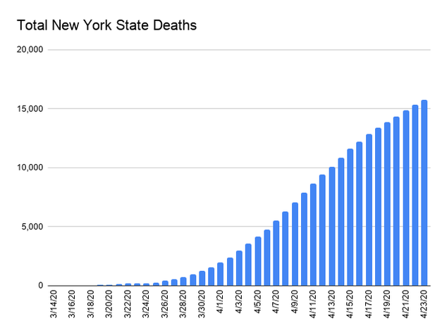
As of April 23, New York is leading the United States in deaths, with around four times the total of the next state, New Jersey. Note: these numbers only include people confirmed to have died of COVID by the Department of Health, and may omit a large number of people who died at home.
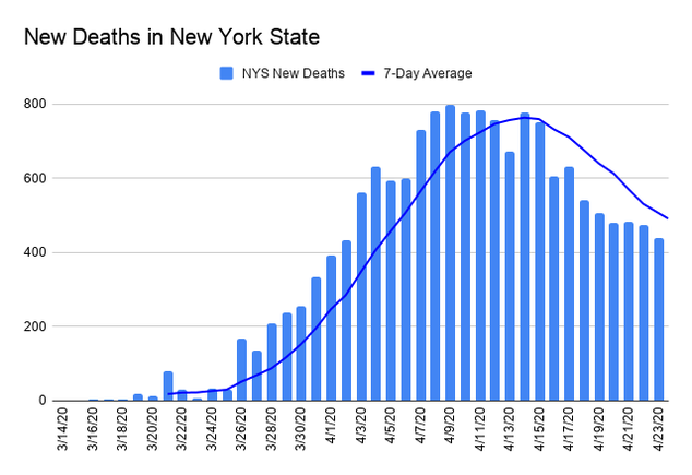
It will be easier to discern when the curve flattens by only looking at new deaths.
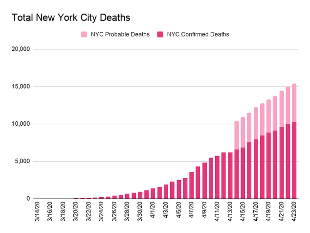
On April 14th, the NYC DOH began reporting "probable deaths"- people who had COVID listed as a cause of death on their death certificates, in addition to deaths of people with confirmed COVID tests. This raised the number of COVID deaths in the city by about 40%. This still may not include all COVID deaths since early March, as more seemingly unrelated deaths may eventually be classified as caused by COVID. From March 11 – April 22, 2020, there were an additional 10326 deaths in New York- approximately 30% of these could eventually be classified as COVID based on average historical death rates.
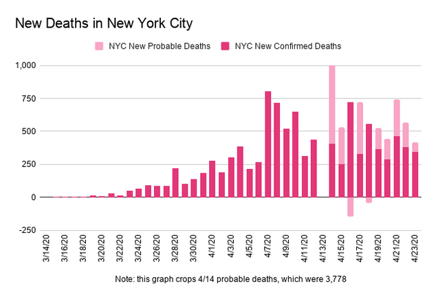
This graph charts total new COVID deaths added to the NYC Department of Health's total each day- because of reporting delays, some of the deaths recorded each day above may have actually occurred on previous days. For a different look at the data reflecting when the deaths actually occurred, you can look at the city's data page, but be aware that the most recent 3-4 days of their data will be very incomplete.
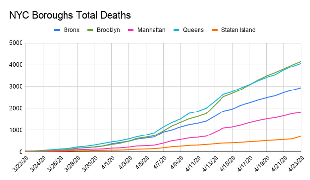
When viewed by borough, Queens has the most deaths because it has the most population and the highest number of cases.
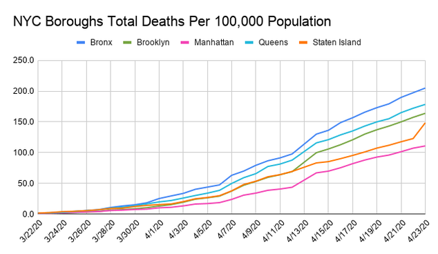
However, once we normalize the death count by population of each borough, the Bronx turns out to have a significantly higher death rate than Queens.
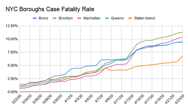
By dividing the total number of deaths by the total number of positive cases, we can calculate the Case Fatality Rate per borough. Currently Brooklyn, the Bronx, and Queens have a significantly higher rate than Manhattan or Staten Island.
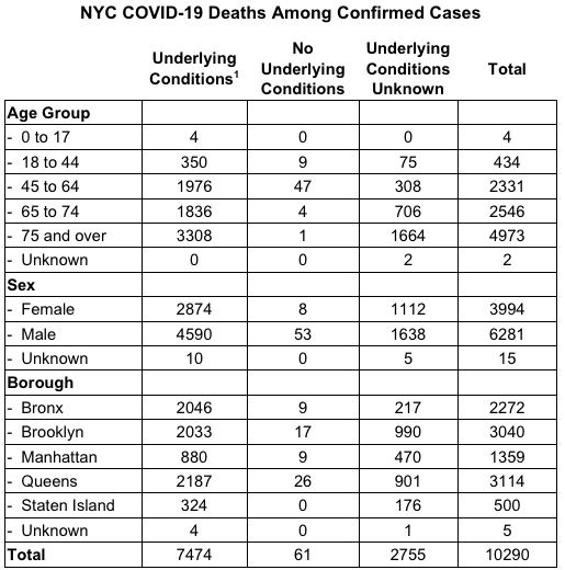
Each day the New York City Department of Health releases demographic data on COVID-19 deaths. Overwhelmingly, those who die of COVID are aged 65+ and/or those with pre-existing health conditions, which the DOH defines as: "Diabetes, Lung Disease, Cancer, Immunodeficiency, Heart Disease, Hypertension, Asthma, Kidney Disease, and GI/Liver Disease." Note: these demographics include "confirmed" COVID cases only, and exclude "probable" deaths.
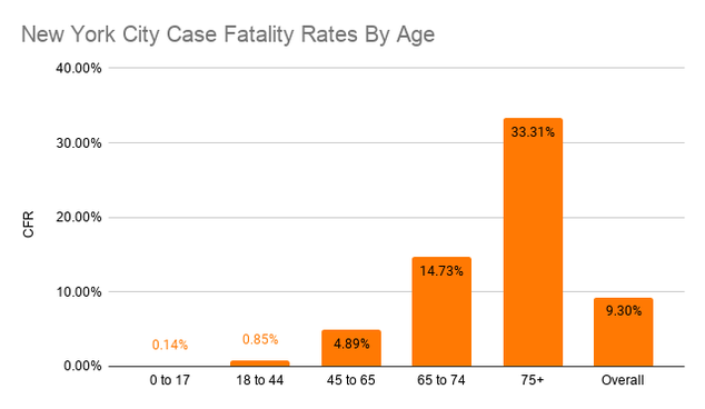
The New York City case fatality rate has been around 5% overall, but older people have died at much higher rates than other groups. This graph is based on both confirmed and probable cases through 4/14.
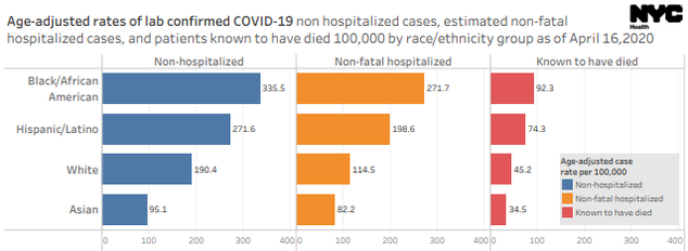
African-American and Latino New Yorkers have been diagnosed, hospitalized, and died at rates much higher than those for Whites and Asians.
Hospital Capacity
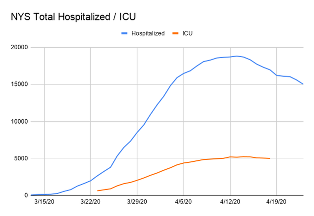
Over time, serious cases of COVID will put patients in the hospital, and once they're unable to breath on their own, into the Intensive Care Unit. Before the crisis, New York State had approximately 53,000 hospital beds and 3,000 ICU beds. On April 9th, Governor Cuomo said projections indicated the state's current stock of 90K beds appeared to be adequate.
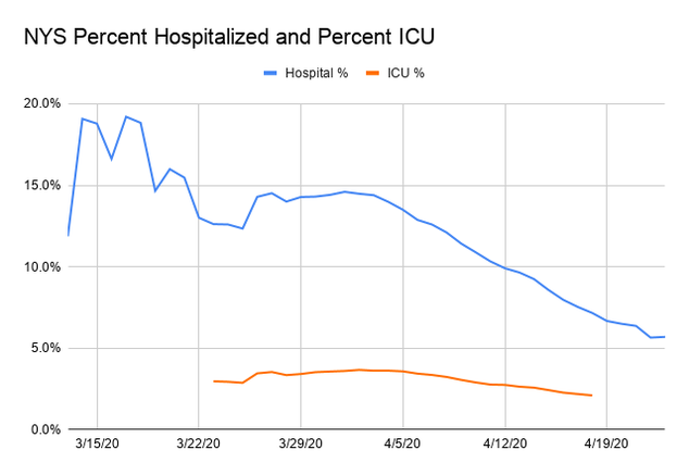
While total hospitalizations and ICU cases have increased, the percent of positive cases requiring hospitalization or ICU treatment remained fairly steady, at around 14% and 3.5%, respectively. However, starting on April 3, the percent of positive cases requiring hospitalization began to slowly drop, as total number of positive cases grew faster than hospitalizations (and hospitalizations eventually began to decline).
Bending the Curve
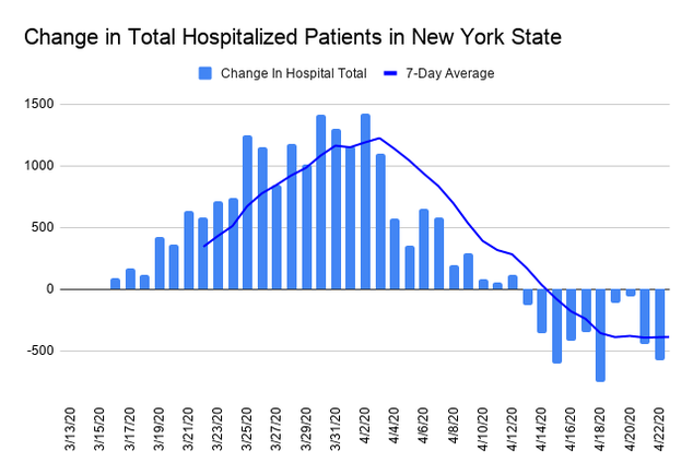
One measure of whether the curve is bending is the change in total hospitalized patients. Earlier in the month, total hospitalizations were increasing by almost 1400 patients on some days, but recently the daily increase has been dropping, and may soon turn negative. Note: this graph shows the net change in hospitalizations- this week, about 1500 patients have entered the hospital per day, but more have left the hospital, either because they were cured, or they died.
Comparing New York City to Other Hard Hit Areas
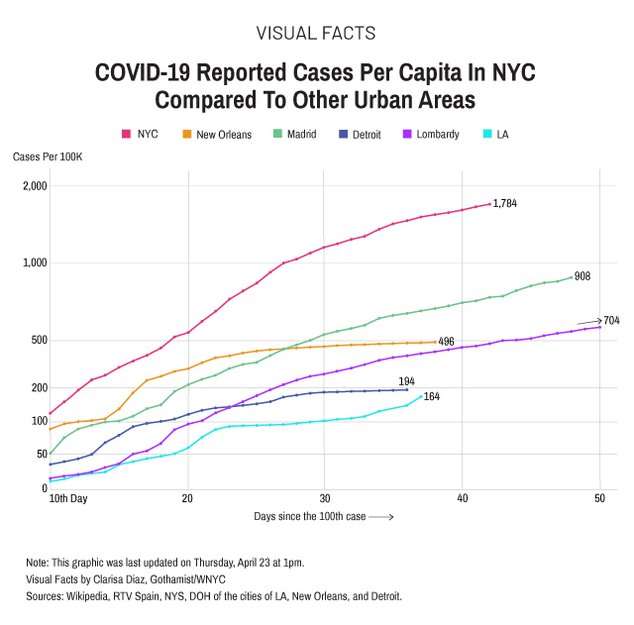
New York is currently the world epicenter of the COVID outbreak, outpacing even the most affected cities in Italy and Spain. The New York Times also has a good infographic comparing world cities.
What Will Happen Next?
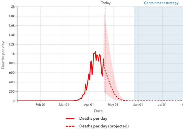
There are many models that predict the future of the outbreak, but Governor Cuomo has repeatedly praised the Institute for Health Metrics and Evaluation's COVID-19 model. In their 4/20 update, the model predicted an apex on April 9th, with deaths falling to near zero by early May, with total deaths of approximately 23,700 in New York State- they indicate "After May 27, 2020, relaxing social distancing may be possible with containment strategies that include testing, contact tracing, isolation, and limiting gathering."